The Idea is manifest. The mind takes a snapshot and the idea is sent into the circuitry. The Idea is enlarged through the prediction. The circuitry nurtures the system with the prediction as the idea is brought to reality.

2/05/2008


2/04/2008
The Lugubrious Game — Dali Collage?

This is a quote from the book Dada, Surrealism and their Heritage (MOMA, 1968) concerning the painting "The Lugubrious Game" by Salvador Dali
"The eclectic Surrealism of Senicitas....led in 1929 to Dali's first mature works, a series of brilliant small pictures whose hallucinatory intensity he was never to surpass. In some of these, The Lugubrious Game, for example, the photographic realism of the painted passages is indistinguishable from those parts of the surface which are actually collage bits of photographs and color engravings. In equating his painting technique with the verisimilitude and surface finish of photography Dali here brought full circle the "perversion" of collage that was initiated by Ernst. Dali maintained the activity of collage, but in disguising even those differentiations of image components still visible in Ernst, he produced, in effect, an anti-collage."
Looking at this piece as best as one can on the internet, I cannot tell what portions of this painting are photo, and which are paint. Is anyone familiar with this piece that can pinpoint this? Dali's masterful painting technique once again has fooled me and I can't tell from lame .jpg files.
Through a Google books search, I found this further quote in Realism, Rationalism, Surrealism: Art Between the Wars, by Briony Fer, David Batchelor, Paul Wood regarding this particular Dali painting.
"There is no coherent unity to the figure; it is only the sum of these fragmented parts. But it is not only this figure that is 'dismembered'; in addition to some real elements of collage stuck on to the canvas, the painting as a whole deploys a collage-like technique to assemble fragments and parts."
2 Copyright tidbits
• I need to buy this book. Clarity can only come from increasing my knowledge.
The Copyright Permission and Libel Handbook,by Lloyd J Jassin and Steven C Schechter
• LLOYD J. JASSIN is a New York-based publishing and entertainment attorney in private practice and he also was involved with the afore-mentioned book. Here's a link to his document Fair Use in a Nutshell. This was written as a checklist for writers, but for collage artists, similar rules apply. I liked the general advice on this page.
2/02/2008

1/31/2008
Edgy Collage by Bernie Stephanus

I gotta tell ya. There's nothing I like better than to sink my eyes into some seriously edgy artwork. And if the edge stuff is collage work, it really stops me in my tracks.
Today I came across the work of Berni Stephanus, a collage artist of massive proportions. A plethora of mixed media work, including both painting and collage can be found on his site. Upon reading the comments on his website about collage I was ready to agree with his explanation:
"I call my works mutations or grafts because I want to realise impossible transplantations in a different way than the cubists, dadaists and surrealists. I focalize on the borders between the pieces in order to obtain a real graft. For me it's like my brain is working, trying to make sense out of all impressions, souvenirs, sensations ..."
What and excellent way to describe the process of collage. Grafting. It makes me think of the organic process of grafting in agriculture, making a branch grow where it didn't before.
"And the fact that the grafts are visible (instead of smoothening the picture) shows the fracture and in the same time the healing since the whole functions as a coherent picture."
I also feel this compulsion to savor the edges of collage work. Some of the most interesting things about collage revolve around the treatment of edges. Some artists go for a stark contrast between colors and textures. Others nurture the edges like a suture...and take special pains to create smooth transparent transitions.

One of the most fascinating things about Mr. Stephanus' work is his ability to create such a unique effect by combining painting with small bits of collage elements. His series, Massacres, is amazingly detailed, extremely emotional and graphic as literal hell. I love it.

Abraham, painting with collage,108x130cm, 2001
This man has done a lot of collage work. I am serious. There are over 1800 collage works on his site, and the number grows daily. I was very impressed at his deep exploration of his own new technique. Inspiring stuff.
1/30/2008
Landscape Containment Unit
This is an example of something new I am working on. This piece isn't quite complete, however enough is there to get the idea.
Certainly it's a departure from my usual fill the paper mode.....leaving white showing in a more graphic type of image.
I wonder, can you still tell it's done by me?? Does my style show through, no matter what style I use?

Certainly it's a departure from my usual fill the paper mode.....leaving white showing in a more graphic type of image.
I wonder, can you still tell it's done by me?? Does my style show through, no matter what style I use?
Change of Pace
As you may already know if you read this blog, I have been working on changing my style a bit, and challenging my own creativity. This is so much easier than it sounds. I can't explain how odd it is to create work that's "different" from what you are used to doing. I stare at it, and try to resolve the piece, and inside my brain is saying "WHAT is THAT? You need to put something over there...you need to do this you need to do THAT!!!" My brain WANTS to go the same route, portray things the way it has already learned to do so. Because of this, the new stuff looks so utterly strange, and I am learning to leave it that way. It's supposed to look different, stupid, that's the idea!
I was approached by someone recently about doing some pieces of artwork on the theme of "predictions" for a book soon to be published. The theme had some specific points that I was to attempt to address in my artwork. This, I felt, was the golden opportunity of change that I had been waiting for. I have a theme I have to address, and I have to use my left brain in order to conjure up symbols and images that can relay the message that my right brain has to carry out. My left brain/right brain switch sometimes get a bit sticky and it's hard to let one half rest so the other half can do it's job properly. But, the point of this post is to try to describe how adversely my brain reacts to the changing look and feel of my artwork. At first, I am almost repulsed, and I immediately start falling into my old collage habits (have you noticed a pattern to your art creating? I have. And now that I have done literally hundreds of collage work, those patterns are starting to go deep!) I can make this look "right" by adding this, or changing that. But at this moment, I am resisting the urge to go where I always go. So I have ignored my brain, and tried to just let it be. I have done 5 pieces so far where I am trying to head in new directions. Out of the first 4, I liked the end result of only 2. And on the 5th I really am just sitting on it, leaving it alone for a few days, rather than finish it or go back to old habits.
I guess its just a matter of training my brain that YES< these are GOING to look funky. That's the idea. There may be another 50 pieces that go by looking weird before my brain starts to think that my new look is "normal".
I wonder. After this exercise, will it still be so easy to sink into my old art habits? OR will my new habits start to take over?
1/25/2008
The Image Collections of Goofbutton

I Can't Be Hypnotized — 9 x 11
There's a site called goofbutton where Jeffrey Meyer has posted a whole bunch of interesting visual collections. In addition to a lot of his own personal collage and comic artwork, Meyer has put together groups of related images. They are in various categories, such as scientific drawings, or typography. They are intereresting as possible collage ephemera, but I also find these working for me as standalone pieces. There is nice unity in these pieces.


A couple of examples of Goofbutton image collections
1/21/2008
Nu-real : a timeline of fantastic photomontage
Photomontage work is full of such possibility. The layering of photos to create various Throughout time, a progression of style has brought forth a vast variety of creative work.
nu-real : a timeline of fantastic photomontage and its possible influences, 1857 - 2007

This site has a really great pictorial timeline depicting the history of photomontage. Included are images that portray various movements and geographical differences over time. I really liked this site because of its stylish design. I like sideways scrolling, it is a change from the norm. A lot of time was spent culling this vast array of works. I appreciate all that effort!! Max Ernst Collages, bauhaus, belgian collage, Magritte, Joseph Cornell and several great collage artists are shown along with the part they played in the history of photomontage. This site is worth your time for a peek!
Art-pjm

ARTpjm is a French site that has a wealth of collage information. A lot of the pages are translated and an English version is provided. The gallery has lots of collage work, too. But the most fascinating thing about this site was the seriously technical descriptions that were provided about the topic of adhesion. Techniques are varied, and materials are even more varied. The Artpjm site had some discussion regarding the physical principles behind the act of creating a sticking bond. I was really amazed at the technicality of these pages, altho I will need to meditate on it to see how it can help me in my work. Visiting the Art pjm site will be worth your while.
I have hesitated to talk much about materials on this blog, but after I received an email from Laura noting her interest in the topic, and the comment on yesterdays post leading to a wealth of information on materials, I decided it was time to look into the ways and means of collage work. Sharing of expertise in this area may be a big help to all collage artists.
Personally, I use a lot of strange things and not all of them like to be attached to each other!!! How about a potato chip bag? It's composed of a foil-like substance and it's designed to keep air and germs away from your chips. It is not porous in any sense, and yet I am wanting to use it's reflective qualities on my piece. At this point I have to go into the glue decision mode and decide how it's going to stick. I'll make a choice, and if that doesn't work, I go ahead and attempt something else. That's part of the challenge!

The Waiting
Mixed Media Collage 12.5 x 19 on Yupo Acrylic, sheet music, wallpaper, childrens stickers, vintage sewing kit, dill potato chip bag, Korean dried seaweed bag, vintage handwritten letters, vintage photo, magazine clips
1/18/2008
Exene Cervenka - She's a Collage Artist too?

Grace • 2007 • mixed media on canvas panel • 12 x 9" UF; 15 1/2 x 12 3/4" F

Princess Die • 2006 • mixed media collage • 24 x 20"
She has a hardcover book called Magical Meteorite Songwriting Device filled with more of her rich imagery. I also found a book called America the Beautiful, which is loaed with poetry and her collage work. I am intrigued. There is more info on her own site, and some beautiful scans of her collage work on DCKT.
1/15/2008
David Brady: Fearless Leaders

"The Moment", 2007, (detail) mixed media with found objects and oil on canvas, 21x41x2"
The topic of our leaders is something that invites a wealth of imagery. David Brady has been participating in an exhibition going on in Culver City at the Whole9 Gallery since November. "Fearless Leaders" brings you the perspective of 4 artists, David Brady, Mark Acetelli, Dan Trantino, and Kayne Young.
This show wraps up soon and ends on Jan. 19, that's Saturday! West coast folks may want to check this out!

Inner Strength 2007 (detail) mixed media with found object on canvas, 15 x 24"
The Whole 9 Gallery
6101 Washington Blvd. (3 blks west of La Cienega)
Culver City, CA 90232
Mon-Fri: 10-6
Sat: 2-5 pm
Phone Lisa Schultz at: 310-836-4603
Collage Clearinghouse Cleans House

Hanging in the Balance —The latest piece for the Sharon Springs DK Project
Something to decorate this post!
There are so many little things that I can do within my own websites and blogs in order to make it easier for both myself and readers. Finding the time for this petty stuff seems like a waste, but when I compare blogs and features, I find myself lacking!
I have been trying to organize the blog a bit today. I went back to all my previous posts and tried to cull links in order to create a more helpful link list. On the sidebar is a growing list of collage related websites, and also a list of collage blogs. The blog list seems small...I probably have to spend more time paying attention to what I am viewing and keep this updated. I also tried to list a few collage-friendly galleries. Hopefully this will improve your collage clearinghouse blog experience and make it easier to use all this info!
1/11/2008
12 Tales of the Forest Book 1—Free Download

12 Tales of the Forest Book 1—JULIE SADLER
Have you ever wanted to inexpensively reproduce a small group of your art and do it creatively at the same time? The One Page Book is the answer!
There is an intriguing folding format that allows you to create your own little book with big impact. The one-page-book utilizes only one side of the paper, keeping your printing costs down. With it's 8 tiny pages, the one-page-book could be the perfect vehicle for expressing yourself. The folding isn't that difficult to describe, and the result is a great book ready to move your message into the hands of those you chose.
A few years ago, I saw this format in The Gleaner, a great little zine that is spearheaded by Sherylynne. Immediately I recognized it's potential for a cheap little book product. Printing can get expensive and this little book only requires printing on one side. I did a series called The Fig., which were 8 little books based on architectural figure drawings and sold them on magikglasses. They are silly little books but I loved the easy and creative folding format, and who can resist opening up a tiny book? There are a precious few left. If you are interested in obtaining a copy email me about it.
A couple of weeks ago, Lalande Digital Press started promoting the one-page-book and they posted some fabulous examples. Matthew Rose created IT WAS A VERY BAD YEAR, the first in his series from Falling Boy Books.

IT WAS A VERY BAD YEAR — MATTHEW ROSE
Musicmaster & John Bennett created JOW. And the latest example was done by Fred Griot, a poet and artist living in France.

ONE PAGE BOOK—FRED GRIOT
They have got a great idea over there at Lalande, promoting the one-page-book as a marketing tool to be distributed as needed for your share-your-art-needs! I like the idea!
I have been working on a new series of my own. It is called 12 Tales of the Forest. It is 12 mini tales that are based on the woods and forest creatures. Each month I will make one of these books available for download. You can print these out at home and create your own set of 12 one page books. Book Number 1, Winter Velvet Snow Storm is available for download this month. This is a 2 page pdf, with full color artwork on page 1, and the complete folding directions on page 2.
Download Book 1 —Winter Velvet Snow Storm Here
1/09/2008
Drawing on the Artist Within

I picked up this book, Drawing on the Artist Within, by Betty Edwards, after reading a comment about it somewhere on an art blog. I was already familiar with her book Drawing on the Right Side of the Brain, and this book suggested some really interesting ideas about the act of drawing.
Drawing on the Artist Within is more about increasing creativity and it's really pretty interesting. There is an exercise somewhere in the middle that I performed the other night and I thought it was worth mentioning.
She tells you to take a piece of paper and fold it into eighths. You label each of the 8 sections with various emotions, such as anger, peacefulness, etc.. You are to draw using lines (no pictures, no symbols, think analog!) and express the emotion. So I do this. I sat there for about 15 minutes and drew. Next, you compare your drawings with other people's examples in the book. This is where the stunning part happens. Amazingly enough, the drawings are quite similar. Your drawing of peace looks sort of like my drawing of peace!! I think this is an astounding thing, and a great personal discovery.
This means that underneath our layers of words and speech, looks and fashion, nationalities and religions, we all understand and "speak" the same visual language. That is so empowering!! What a confidence builder! It means that when I sit down to do a piece of artwork, and I want to share my feelings of loneliness and emptiness, there's a good chance that if I "listen" to my inner voice when placing objects on the page, I will be able to convey that message to you. Listening to the voice is key though, and it's easy to let other things sneak in and influence what you put in a given piece of art. That must be the "work" part of art. It's work to keep focused on your own idea, your own reflection and your own voice.
1/07/2008
A peak at the New Stuff
For these 2 pieces I was looking for a New Look. I wanted something entirely different than what I normally do. The rules I set up for myself were...photos and paints, inks only. No ephemera.
On this first one I did follow my own rules, but I included pen and ink trees, and that's sort of cheating. A lot of my pieces have trees--probably too many pieces have trees!...so I didn't entirely break out of the box. I sort of like this one tho.

I decided to post these 2 pieces that are driving me crazy. This first one actually is complete at this point...I apologize for the lousy pic, I used the camera instead of scanning, and the middle column has light reflection issues. These were done on Yupo, and handling the pen, ink and acrylic was a bit more challenging than usual. My own commentary would be that the deer and owl are a bit lame...I could blame it on the paper, but instead I will fault my own skills at painting, drawing...(And, just to note it, I wanted a fox in there too. Not sure I am wanting to put him in there tho.) There's a huge reason behind the deer leaping out of the architecture. You see, one day I was there at the empty bath houses in Sharon Springs to paint. I sat there for 3 hours or so painting on a cold day in April. After I was done, I got up and walked around the inside of the decaying building. Way in the back, laying and stinking on the ground was a dead deer carcass. This scared the crap out of me! I stayed away for 3 months (mostly waiting for it to decay the rest of the way). This pic was an attempt to infuse my work with meaning. Unfortunately, only I know the deer story, and well, now you do too!

This second yellow one, the photo really sux, sorry...The bottom is more saturated with yellow than this photo shows. This one REALLY has me stuck! I have not done much to it, it's at the "I hate this piece" stage. I want to add pen and ink to the bottom portions...but I wonder if it's worth my time. I have tried tipping this one upside down, and sideways too...and no matter what it bugs me. It may just be a trash experiment, but I feel as tho I let myself down on it a) by not finishing it, and b) for not liking it! Not only that, I didn't follow the rules about ephemera. However, I did no trees on this one, just plant leaves!
I don't know what to think of these. I just need to keep on trying new things, eventually it may start to feel "right".
1/05/2008
Lady DK
My art studio is divided at this point. There are these 2 really different and graphic works that I am trying to work with...the new stuff, the ones where I go away from my comfort zone. Those are rattling me and I am not quite done with either of them. It has been causing me a mild bit of anxiety, those So-New pieces. I just want to do art because I want to and let it come out, whatever it may be. I decided to let myself do a few kinds of works side by side. I allowed myself to enter the comfort zone and do what I wanted to for today. This piece built itself. Maybe now I can get back to completing those other 2 challenging pieces!!
How is this piece appropriate for my day? Does it have any kind of feeling that anyone else can recognize? Outside the trees look very much like those in the photo, very spidery and skeletal. Their is a swirling to them...the girl, well that's probably me looking out the window staring at it all. I heard an owl the other day and so did my friend. Seemed like the totem to place on my shoulder. Why is she Lady DK, well that's because I used pieces from a really shabby agricultural bulletin from 1898! It was all about pests, with great pics of caterpillars and decaying plants. That's me, always fascinated with the Decay, the DK...She's sort of regal looking, and I am feeling above it all today, above the stress of life, work and self-imposed art restrictions and obligations.

How is this piece appropriate for my day? Does it have any kind of feeling that anyone else can recognize? Outside the trees look very much like those in the photo, very spidery and skeletal. Their is a swirling to them...the girl, well that's probably me looking out the window staring at it all. I heard an owl the other day and so did my friend. Seemed like the totem to place on my shoulder. Why is she Lady DK, well that's because I used pieces from a really shabby agricultural bulletin from 1898! It was all about pests, with great pics of caterpillars and decaying plants. That's me, always fascinated with the Decay, the DK...She's sort of regal looking, and I am feeling above it all today, above the stress of life, work and self-imposed art restrictions and obligations.
1/04/2008
Mister Rose's ABC- A Must Have

I have written about Matthew Rose in previous posts and I am a serious fan of his work. He is a collagist living in France, and his work is sometimes humorous, sometimes serious, but always quality. I was lucky enough to meet him last summer at his show at Gallery-In-The-Field in Vermont. He's a busy and inspiring guy, both a writer and an artist, and his latest project is a sweet combination of both talents, an ABC book. His book was printed by Lalande Digital Art Press in Paris, and is of the quality one would expect from the collaboration of a printer and artist interested in personal presentation of artwork. Matthew Rose is a master with gouache and he creates the most gorgeous crackling effects--I really love this about his artwork. I am impressed that Mister Rose's ABC book shows the surface of the artwork with such detail.

Peppered with Mr. Roses' dazzling stylish images and poetic words that are as colorful as the pages, this book is a treasure for young and old. I was more than amused at the wording he chose for some of the letters, "V is for Vicky, a vivacious Volcano, sometimes she's vapid, but she's always vacationing. Vicky's my Valentine!" hilarious!
I ordered my books from Matthew, and promptly was rewarded with some good laughs. You can get a copy by emailing Mr. Rose here..But I suggest you don't wait! They are selling like hotcakes!!
1/03/2008
Creative Life in Progress
Russell Smith is a collage artist living out in Seattle. He has a blog called CreativeLifeInProgress...where he posts a vast variety of collage art. I am intrigued by his work. There appears to me to be 2 separate developing styles in his pieces. I found many involved pieces which contained a lot of texture, some monochrome, but not all. There is a lot of line and movement and I really liked some of these monochrome pieces a lot.


Leaning Toward The Lemon Light • Green Galaxy Pop Dimension
Woman in Mid-Century Modern Room, with foliage on the ceiling.
I also found these more illustrative collages on his blog. These are great! The title I really liked and the fact that there was foliage on the ceiling was somehow normal and satisfying to me! I thought of Hannah Hoch...and I don't know, but the retro furniture gave me a strangely comforting feeling. Nice piece.
He posts often and there's more to see here.
Leaning Toward The Lemon Light • Green Galaxy Pop Dimension

I also found these more illustrative collages on his blog. These are great! The title I really liked and the fact that there was foliage on the ceiling was somehow normal and satisfying to me! I thought of Hannah Hoch...and I don't know, but the retro furniture gave me a strangely comforting feeling. Nice piece.
He posts often and there's more to see here.
COPYSHOP - The Art Gallery of Knoxville

IF VALUE, THEN COPY
The Art Gallery of Knoxville has a really cool site up that challenges the way we think about copyright and cultural property. The site is kinda insane with a flash interface with floating layers of text, information and imagery. Check out the block of text about Marcel Duchamp on the home page. It's excellent. I am still exploring the vast amount of stuff on this site or I could write more about it. I recommend you check it out for yourself.
Some teasers:
"The Art Gallery of Knoxville is dedicated to new and emerging Art. It is an open space to cultivate ideas of Art and social engagement."
"COPYSHOP is a place where you can copy everything. In COPYSHOP you will find products that challenge intellectual property. They can be modified originals, improved copies, political anti-brands. -or a SUPERCOPY as new as the original."
"COPYSHOP is a franchise model for likeminded shops all over the world.
We are interested in working with groups and spaces to develop products for COPYSHOP, host mobile versions of COPYSHOP, and create franchise opportunities for the installation of COPYSHOP in other communities."
If you live in Knoxville, there is "Pirate Cinema Knoxville" showing every Friday and Saturday at 7 pm. The Grand Opening is tomorrow night!
The Art Gallery of Knoxville • 317 N. Gay St., Knoxville, TN 27917
art.gallery.knoxville@gmail.com
12/29/2007
Capture
I started this piece a few months ago. I was craving to do something different, something brilliant...and I ended up freaking myself out so bad i could not continue. For a long time only the 2 pen and ink trees and the photo were the composition. This morning, I just said to myself, Hey, this doesn' t have to be your own personal Mona Lisa. Just do something you feel like doing. Finally, I was able to get by my whole aspring to new heights anxiety and finish it. I don't understand the tension that exists within myself to do things. I really want to do something so unique that it is unheard of. And then when projects start to look strange on the paper, I can't stand to leave them that way and explore it. I end up making everything look so much like this piece. It's obvious that I did it. It looks similar to countless other pieces I do. It's difficult to break out of your own mold. I don't know if I can. or should.


12/28/2007
Making Collage Personal

It's been a long tough year for me. In May, my mother passed away from a vicious case of lung cancer. I understand it was a hard thing to avoid the cigarettes. Being a collage artist, I get a chance to peruse paper from different time periods. It's enlightening. The frequency of ciggie ads is amazing. The best pictures of actresses and actors seem to always contain the fashionable cigarette. The pressure to smoke must have been quite great. My Mom was just one of thousands and probably millions of folks sucked into the smoking habit. Getting back on track here though, the whole cancer thing is pretty sobering. You can't exactly get through an experience such as watching your mother dying without some kind of messages, feelings and repercussions. I had to withdraw into myself and feel the experience of loss for awhile. I stopped doing my daily collage work. Instead, I replaced it with lots of thinking, sorting, and learning. I read a couple of art monographs. I searched the web, reported to this blog, and recorded new reflections. It has been about half a year, and now I feel as though maybe I have worked through some of my grief. I am starting to get hungry though. I have been on pause...waiting to push the play button. It isn't like I didn't do ANY art over the past half year, because I have, but just not to the higher level of quality and quantity that I want to achieve. It took awhile, but my emotional well has filled back up and I am ready to tackle some new things. My goal is to get better at infusing that emotion into my pieces. I want to pour it out and smear my attitude on everything I touch. I have always tended to be "just" visual about things. How does it look? I enjoy color, line, and shape. I have explored context and textures...But that last and final ingredient, and probably the most important ingredient, the emotion, the message...that needs some work. I tend to do things and they come out autobiographical. I can't stop that from happening, but the signals in the work that point to the meaning of the piece are so subtle I wonder if someone else can even see them. I even wonder if the signals are even there! You get so one-sighted about your own work sometimes, it is a wonder I feel any piece is valid or complete! So this next phase of collage work that I do will be done with the emphasis on getting that feeling out and making collage personal. Difficult task. I have read that the older the artist gets, the more difficult it gets to achieve. I am trying to pump myself up for this challenge.
Collage Art by Ray Johnson

Untitled (Amei Wallach) 1977 collage on masonite 15 7/8 x 15 7/8 inches
The recent package of postcards that I received has piqued my interest in Ray Johnson once again. Life has a way of pointing me to answers that you seek, and sometimes new conclusions can be found in things that you have already examined. And so it is this case with my personal study into the life of Ray.
He was the father of mailart, the New York Correspondence School, the man who mysteriously jumped off a bridge to his death...but amidst all these personas was a serious collage artist. I found a really nice selection of 48 Johnson collage works on the gallery site of Kinz, Tillou + Feigen. My eyes were opened to his expertise immediately. He had a way of extracting the essence of a person (or persons!). He stripped people of their facial features, and filled their hollow shell of a silhouette with active imagery containing hidden cryptic messages and references. The technique is fascinating and after looking through only a few of these works, the collage genius of Ray Johnson becomes manifest.

Untitled (Janet Flanner's List) 1974-1989 collage on cardboard panel 15 x 15 inches

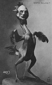
Sculpture by Max Ernst
In Untitled (Janet Flanner's List) I really appreciate the play of black and white, and the little figures that Ray Johnson creates...they seem so retro and futuristic at the same time. I think of Max Ernst when I see some of the faces in Ray Johnsons work. Some Ernst sculptures especially share this face-in-the-artwork similarity. (please pardon my own strange parallels!)

Untitled (Bill de Kooning) 1977-1990 collage on masonite 12 x 9 inches
Something about the echoing of shapes and the use of lines in Untitled (Bill de Kooning) really attacts me also. And here again the little cartoons and faces appear. They are such benign little creatures...they don't impose happiness, sadness or any other emotion to me. They don't stand out necessarily, but instead seem part of the design of the grander scheme of things. Brilliant.
One of my favorite things about collage is it's ability to blend things and make things one, a tenet of the Ray Johnson philosophy.
I know that he had his own xerox machine. And I also see a lot of monotone collage. I know he could paint and draw...but I am guessing he used the xerox machine extensively to create some of the pieces that later become part of these collages. This really personalizes things. I equate this to my own mash up acts of photography, alteration, print, cut, paint, paste. There's something about the black and white. It wakes up my pen and ink roots. I get to revel in the lines and shapes. I think inside of me is a bit of a cubist.

Untitled (Andy with Cows) 1976 collage on illustration board 15 x 15 inches
That should be enough evidence of collage intelligence. There are so many more examples of Ray's creativity. Visit the Kinz, Tillou + Feigen site. I think some of these pieces (and others) may perhaps be for sale. I wish I could afford any of them!! A collage collection worth half its salt certainly should contain at least one of Ray Johnsons works. I better start saving.
12/27/2007
Collage Artwork by Kareem Rizk
Todays collage adventure takes me to the other side of the globe off to Australia. Kareem Rizk is a collage artist working with various media, including oil pastel. I don't use pastel too often, it drives me nuts how it smears, so I have to admire his controlled use of it. Pastel does cover well, and it is an essential tool in Kareems work. He creates balance using blocks of pastel color and to tell the truth, I am digging the effect he creates in the piece "The Park". On the left is a color block of pale almost skin colored pastel, and directly next to it is what looks like a collage pieces of paper. The torn edges at the bottom blend so nicely with that pastel edge....


I also like the openness of these pieces. There is a freshness to it, reminding me of THS and his gluebooks. However, there is less scrawling here, and more of a controlled feeling in Kareems work and I really do enjoy the way he places the pieces on the page for weight. There's a large gallery of work on his website for your viewing pleasure.
I also like the openness of these pieces. There is a freshness to it, reminding me of THS and his gluebooks. However, there is less scrawling here, and more of a controlled feeling in Kareems work and I really do enjoy the way he places the pieces on the page for weight. There's a large gallery of work on his website for your viewing pleasure.
12/26/2007
Present as now, Present as gift

On Christmas Eve we were so busy that we didn't have an opportunity to check the mail. I had been looking for gifts in the mailbox almost every single day lately, since I was an online shopper. Getting ready for the next day took all my energy and at that point I thought I had all the gifts. So I let it slide.
Christmas morning, I get the mail and amidst the usual cards and salutations (and bills!) is this strange envelope. On the outside 2 different post cards are attached with tape. They are post cards about Ray Johnson. I glance at the return address which I don't recognize. That's odd.
I open up the envelope and inside I find about 10 different post cards, all which are pictures of Ray Johnson in various places, doing various things. I search the backs of the post cards certain that I will find a written note or some clue of the meaning of these contents. Of course, there is none.

This tickles the living daylights out of me. Here it is, Christmas morning and my first present is this strange packet of special post cards from someone I don't think I know!!And they are about an artist that I study about and admire....
I go back and try to figure out where they came from, how did this happen. I AM a fan of Ray Johnsons, and in fact have recently purchased his movie "how to draw a bunny" on amazon. I await it's arrival! But I still couldn't find a connection. Then I noticed that the return address on my envelope had the same name as the photographer of all these great Ray Johnson pix! His name is on most of the cards that were sent to me. William Wilson himself has sent me a little treasure trove of very cool goodies. I am psyched!! What a crazy thing. I just love intrigue, especially on Christmas day. That's a gift in itself.

The outside of the envelope says, "[mail art] has no history, only a present, which was a pun, of course, on present as now, and present as gift. A pun on my own way of giving information and objects or whatever, in letter form."—Ray Johnson
How bizarre! This packet was also a present to me, in the shape of a Christmas morning present. I love it when things like this happen. I can't wait to respond to it!!

Hope Kroll—Collagiste

Test Pattern
I came across the work of Hope Kroll awhile ago and have kept her bookmark in my list ever since I came across it. I have to admit I have a fetish for things Victorian, things nature-related, and Hope uses these subjects in her work frequently, drawing me in.

Beyond this Place
Hope Kroll's work is special because of it's 3d quality. Upon first examining her pieces, I was very curious as to what the interesting shadow effect was caused by. I have used pen and ink in the past in order to create this effect, but in her work the shadows are absolutely perfect, which of course my hand drawn ones were not! Reading the artist statement on her website, I was drawn to her explanation of using foam board. She says, "Recently, I have begun to make use of archival form core to lift elements of my work off the page. I find the three-dimensional effect lends additional visual drama to my work and helps to showcase the highly meticulous nature of my cuttings." I agree with her. The effect is stunning and in some of her pieces I feel as tho the drama is enhanced by this shadowing of image. It also has a way of over-enhancing things with emphasis, which could be helpful in future work.

Twilight
There is a lot of work posted on her site and all of it is intriguing. I have spent a lot of time looking at her things...You can see her work currently in San Francisco at the Triangle Gallery. Her work is showing thru the 26th of January. Also showing are works by Judy Dater and Wanxin Zhang.
12/21/2007
Happy Holidays

seasons greetings from my kitchen to yours
I want to wish anyone who may be reading this a very Happy Holiday.
I will be driving to Philadelphia Saturday morning for some holiday time with my father and grandmother. I will return before Christmas, but I will not blog a post till Wednesday.
Peace Love Groove Art

reindeer ready to leap
Subscribe to:
Posts (Atom)