The blog. I let it die. For awhile.
I have gone through so many personal things over the past couple of years, it became difficult to keep up with this blog. I started to explore other mediums and it felt silly to report about that here on a collage clearinghouse!
I started teaching altered books in my collage Design class at SUNY Cobleskill. I wanted to post pictures about all the wonderful work I have seen and explain how I am teaching this idea. The effort required to DO became more than I had bargained for and I had no time to WRITE about it.
With new zeal I tried my hand at acrylic painting. I have had some time to ferment. I do feel it's important to take time out and live. I take these sporadic breaks from my collage practice often, but hardly do they last this long.
I am working through some new ideas, such as collage in 3d. It's all so exciting and fresh and it takes every bit of the energy that I have and it leaves me so little time to tell the story about it. I regret this and it saddens me.
I am in the process of removing myself from things that seem to waste my time and keep me from living and trying to lean back on things that I felt were life-building. I am thinking over this blog and wondering exactly where does it fall within these 2 categories….

7/09/2014
8/15/2013
#DayDetroit

What a gorgeous piece. I have never heard of Betye Saar but I am glad I did. Sorry we had to meet under such horrid circumstances. The Detroit Institute of Arts owns you, but your future life there is threatened due to financial issues. Detroit is dear to my little old heart. I lived there for a time when I was a young 5th grader. It was a great city, but it really got hit hard in recent times.
Posting this to help the cause. What are you doing? Do something.
the scoop from MAN is...
"In an effort to spotlight the collections at the Detroit Institute of Arts that would be lost if the threatened sale of art in collections at the DIA are sold, all day long Modern Art Notes and many other sites will be spotlight art at the DIA. I’ll be featuring roughly an artwork an hour for the next ten hours. I hope this will help spotlight both the collection at the DIA and the access we have to Detroit’s art. I think that the more people think about what’s at the DIA, the more concerned they’ll be about what could happen there.
How can you help support the DIA? Share artwork here on MAN and at other sites with your friends. If you live in Michigan, tell your elected officials that the future of Detroit is important to you and that you don’t support a fire sale of the city’s future. Best of all: Join me in becoming a member of the Detroit Institute of Arts.
To read more about what we’re doing here, check out these stories in the Detroit Free Press and in the Detroit News.
Sites participating in today’s action include:
- Modern Art Notes
- MANPodcast.com
- Art F City
- Bad at Sports
- Artinfo’s In the Air
- Ed Winkleman
- Mary Louise Schumacher
- Greg Allen
- Two Coats of Paint
- The Art Blog
- Hyperallergic LABS
- Eyeteeth
- Art Practical
- Daily Serving
- Paper Monument
- Italy’s Secret Places
- ArtSmartTalk
- Chad Edward
- The New England Journal of Aesthetic Research
- WBUR’s The Artery
- Andrew Russeth
- Art Note
I hope other websites, critics, art museums and more will join us throughout the day in spotlight art at the DIA. (And please email me at tylergreendc -at- yahoo.com if you do!)
Participate on Twitter by sharing one of our posts or by tweeting your own favorite from the collections at the DIA by using the hashtag #DayDetroit!
I am Hyperallergic
I do a lot of reading about art online and one of my favorite places to catch up on the latest news is Hyperallergic.

They had an article series going on this month about the Selfie phenom and I really learned alot from this series, especially since I had no idea what a Selfie was. I already wrote in a previous post about how I am using the Selfie technique to begin my self portrait work so I decided to write in to Hyperallergic about what I am doing. Much to my surprise, I got some ink! Or computer type...depending on how you look at it!
The article is here...
“For me it started two years ago while I was preparing a wedding gift for my husband-to-be. I was dreaming of our honeymoon on the sea in Maine and everything was tainted with oceanography. I was making a collage series of very personal work for him and I ended up wanting to do a self-portrait — the most personal of all. I didn’t want him to know what I was up to, so a selfie was just the answer! I used my iPhone and took pix until I had some looks, some poses, some attitudes and I printed them out. Using a chosen print as the basis of my collage work, I wove seashells in my hair and even sewed real pearls onto the final piece. I was the Mother of Pearl. A 52-year-old getting married, not exactly white but pearlescent. Since that we have had two anniversaries and I have been able to do two more rounds of selfie portrait collages for him, and I love the freedom. I was hooked. I have decided to do a new series based on these selfie portraits.
“There’s a certain liberation of the art when you put yourself into it. I am free to take my ideas visions and thoughts and paste them as I need without restraint. (Is this what Matthew Barney explores? That restraint?) I always thought my art was autobiographical and I am always the subject even when I try not to be, and when a selfie is used the personal experience is heightened! I don’t care how zany the outcome … how freeing. I doubt anyone will buy these new pieces (with my mug in them!) but that in itself may be the liberation! Certainly it’s become a catalyst for creation.”
7/22/2013
I know I can mimic. But can I create?
My original idea here was to share things about collage Only. A clearinghouse of ideas for collage artists. A clearinghouse of various artists and what I feel about their work. But I get inspiration from everywhere. This blog began to feel so sterile I ran away. I am such a varied individual and I get psyched about a lot of things..not just art. Sometimes these things affect what I am doing so greatly and I feel lame about not sharing the connections here on this blog. It's half ass.
The problem with this clearinghouse idea is that I am such a sponge! I soak up all these great ideas people have and they taint my own chemistry. They bring in thoughts that are like little mini chemicals and they affect where I was heading and I end up with a different end product. Left alone, I find I go to a deeper and more creative place. I know I can mimic. But can I create?
I have boxed myself in so damn far that I have not allowed myself to Live and Breathe some new creative stuff. I have wanted to some silk screen prints and add this flavor to my work for a long time. But I think about a GOOD printer and how it takes time and experience to really become good....My mind does a rip tide and begins to think about how all this fooling around and experimentation takes time away from my art, which is collage. And it all deters me from that creative joy and exploration I love so much. I am a Viking! I want to go on an adventure, even in my fantasy art world.
I broke the box this month. I set up a studio on the 3rd floor of our Antique store and I have claimed the 20x20x20 space as my own. I named it TowerFifty5, a mixture of the fact that it's in a tower and on 55 Willett St.! It's my new print studio. I moved in all my book binding equipment and papers and Chris made me a wall shelf unit. I am ready for action. So what if I am going off on a side track for awhile. So what? I hope it can enhance my art, not detract from it. AND most importantly, My Self gets the experience of doing.
It's all so deep and complicated....
who could explain it? Those inner thoughts and inner subconscious things that find their way out of the soul and into the art?
i will try but honestly it will most likely come up short.
I've always had trouble with self image. My father meant well but was hard on us kids and I never got too many attaboys even if deserved. My looks were average so so and I never was able to look in the mirror without wanting to look away. In my own way I have avoided my "self" and never really came to terms with what exactly it is that I Am. Even in the 50+ years of life on this planet. I have run so hard, I never paused to feel.
As I age, (and age and age) I am forced to look in that mirror and see what I have been hiding. I am finding out what wants to be revealed. And I am finding the time to pause and look within to see what hides deep down.
In my art I have always had problem with people. As a youth, my pictures contained no "man" and no trace of him at all not even a house or man made object. Pure Nature was joy and perfection, get man involved and it all goes sour! In my young adulthood I came to terms with this and began to explore humans and their environment. I used pictures from every source in my collage and nothing was sacred. Slowly I have no decided that as a ...dare we say it? Mature adult...I feel I no longer have the time to hide and I have begun to explore with putting my Self into the picture. The progression seems to point to the fact that I am forcing myself to go Inward and get to the root of the matter and Outward to see what it is that I show to the world.
I have looked back at these selflies, these self portraits a la collage....and I can see wrinkles. Lots of them actually! Without seeming vain, I am trying to look at myself long enough to accept myself. And live with this New Older Me. I am hoping to see beyond the superficial into my mind too. I can see connections in the art with how I feel in my heart. They are my own symbols, perhaps no one else can ever be expected to see them! But I am connecting with the inside and the outside of my Self. Perhaps there are some dormancies that need to come out of hibernation.
This is why these particular self portrait - selfies- pieces excite me enough to bring me out of my sleep and back to this blog. To report it. This excitement of self reflection and nirvana through creative art exploration.
7/13/2013
Selfie
Been reading on the web about the selfie phenom. It's where a person takes photos of themself ...via all those wondrous techno devices we have available to use now. What a blast! Here's a wiki definition: "A selfie is a genre of self-portrait photograph, typically taken with a hand-held digital camera or camera phone. Selfies are often associated withsocial networking and photo sharing services such as MySpace, Facebook, and Instagram, where they are commonly posted."
The whole selfie thing was something I just discovered but the idea of a self portrait via art surely isn't a new idea! Frida did it. Van Gogh did it. Durer did it. And thankfully he did, I love his self portraits most of all.
Each year for the past 3 years I have given my dear husband a set of artwork based on the sea, since that is where we spend our vacation time together. It's a sweet topic loaded with fodder for my wild imagination. Since this set of artwork is for my love, I try extra hard to bare my soul on these works and try to make them extra good, extra special. E X T R A everything.
My love of the ocean stirred romantic visions of my own self, with a lot of shells, seaweed, and ocean wrapped in my hair. I made it real with collage. I took a photo of myself (yes, a selfie) and used it and made it happen. I was the mother of pearl. All whites...freshly married and feeling white. That was my absolute favorite work of that year. I was very pleased with idea of giving my self to him...via art.
Last year, I was all about mermaids. I made images of merchicks and immersed myself in the idea of being a mermaid. I cannot recall whether or not I did a self portrait but I have been thinking about it for months.
Finally this year I decided I was going to do a whole series of them.
An iPad, and iPhone, a camera, my tools of selfie! I have done 3 more self portraits with the aid of my camera. Again these are based on the sea. I cannot stop myself. I have 3 done and I am formulating the fourth. It's a great thing to put yourself in the art. It feels so utterly liberating! And I am not afraid to do anything, like I am when I use a photo that's already been taken of someone I have never met. Through the art I am going places. Places I want to take you....
It's my version of a selfie.
The whole selfie thing was something I just discovered but the idea of a self portrait via art surely isn't a new idea! Frida did it. Van Gogh did it. Durer did it. And thankfully he did, I love his self portraits most of all.
 |
| Durer Self Portrait |
My love of the ocean stirred romantic visions of my own self, with a lot of shells, seaweed, and ocean wrapped in my hair. I made it real with collage. I took a photo of myself (yes, a selfie) and used it and made it happen. I was the mother of pearl. All whites...freshly married and feeling white. That was my absolute favorite work of that year. I was very pleased with idea of giving my self to him...via art.
Last year, I was all about mermaids. I made images of merchicks and immersed myself in the idea of being a mermaid. I cannot recall whether or not I did a self portrait but I have been thinking about it for months.
Finally this year I decided I was going to do a whole series of them.
An iPad, and iPhone, a camera, my tools of selfie! I have done 3 more self portraits with the aid of my camera. Again these are based on the sea. I cannot stop myself. I have 3 done and I am formulating the fourth. It's a great thing to put yourself in the art. It feels so utterly liberating! And I am not afraid to do anything, like I am when I use a photo that's already been taken of someone I have never met. Through the art I am going places. Places I want to take you....
It's my version of a selfie.
 |
| Masquerade - 3rd Year |
 |
| Mother of Pearl - 1st Year |
2/19/2013
I'm teaching a workshop? Yes, I'm teaching a workshop.
The experience of teaching Design and Graphic Design at SUNY Cobleskill as an adjunct for the past 4 years has started to really pay off. I have been doing an Altered Book Final Project for my class for 4 sessions now. It's been really great to see what students can do in just 4 sessions. I get really excited and very humbled when I see the talent that I can draw out of people.
This challenge has appealed to me and I find now that I have some confidence and experience behind my belt. It means I have the skills and courage now to tackle teaching a local workshop. Whitney Hubbard of the Fort Plain Free Library has been urging me for awhile now to do something at her library. It's such a beautiful location, with glorious wooden floors and tall ceilings all wrapped up within this stately and unique old historical building on the corner in Ft. Plain.
I love the space! It's got a huge table, with I don't know how many seats plus a nice glass display case where I can display some samples of Altered Books from times past. I can't wait to let my various artist friends know that their work is on display here in town!
I set up a workshop based on 6 weeks, figuring the general population will need 6 weeks...some will miss some clases, some will be so challenged it will take awhile, and others hopefully will be in a creative rapture and be unable to quit!
I am so glad to be active and busy again in my art life. The past 8 months have been difficult while I quit my day job and took on working with my husband full time for his Antique biz. I finally have relaxed enough and figure that now I really can make enough money to survive. Now I am back at the table, back at work, and teaching even!
Come join us if you can, in Fort Plain during the month of March while we tear up some books!
 |
| The poster |
A Black History Month Special featuring Denise Allen
Please note: All images used in this post are copyrighted by Denise Allen. All right reserved. Permission to use these images MUST be cleared through the artist.
It isn't too often that an exhibit that entices me so much comes to the little town of Canajoharie! This month we are all blessed with an exhibit of dolls, story quilts, paintings, and mixed media by the talented local artist Denise Allen.
I first heard of Denise a few years ago from Chris. Denise shops our Fort Plain Antiques store and buys up all sorts of vintage linens. A passion for linens is something I can appreciate. I like to use them and hoard them. I have my grandmothers hand crocheted work…I use tidbits in my work. Already I had respect for this woman and I was intrigued about what she was doing with all these forlorn linen pieces that I also adore. I couldn't wait to see how she used them and what she did with them.
I have heard many good things about Denise…. She is doing good things for our community! One such good deed is the donation of her time and effort on behalf of Tyson Fowler. (see the entire story here) She sadly lost a son during the 911 catastrophe and has made a story quilt documenting the experience. The proceeds from the sales of the 911 Prints will be donated to the Tyson Fowler Fund. I love how she has taken her grief full circle to help someone living....There's depth to this person and her ability to give to those in need through her work shows it.
She makes story quilts, these incredibly rich tapestries of brute honesty. She has exhibited in some pretty high profile places and I am so humbled. I have more seriously been wanting to catch up with her and meet her ever since I saw her work in person at The Brotherhood Antiques store where she has some things on display and for sale. And so it was with great excitement my pal Travis Button and I went down to The Brotherhood in Canajoharie to see this exhibit!
It's on the second floor of the building in this hauntingy beautiful open and raw space. The bones of this building are exposed and it provides a great foil for the most intricate and decorated work of Denise Allen. The front windows provide an almost primitive style light and atmosphere perfect for absorbing these intense pieces of artwork.
I was very slow as I went through each piece trying to take in all the multitudes of materials that Denise has mastered and used in her work.
There is no limit to the types of items that may appear in one of her compositions. A work with fabric for a base will have painted surfaces, embroidery, attached objects, handwriting and even cardboard fastened to it to help tell a tale.
Her talent is extraordinary in that these various items work together in harmony to tell the story so well, you forget to see the individual parts I was mesmerized and happy to be able to spend time up close and personal with these works in such a cool setting.
Cheers to Joe Fowler of The Brotherhood for supplying such a groovy space for such a great cultural thing for our community. (and especially for me! I love to see this in our town! Collage On!)
These intense pieces of art are really involved and active. It's easy to get lost in her neighborhood and look to see who is there! Her ability to show expression on the faces of the dolls is also quite extraordinary.

They have such feeling, and their elaborate costumes had me wondering which little tidbits she got from our store?
I am so glad Denise has shared her work in this exhibit! This type of web weaving isn't something you see often. This is some seriously good stuff. They call it folk art, but I just call it creative genius!
Denise's 911 prints will be for sale at the Tyson Fowler Fundraising Event on Sunday at Canajoharie High School. See you there!
It isn't too often that an exhibit that entices me so much comes to the little town of Canajoharie! This month we are all blessed with an exhibit of dolls, story quilts, paintings, and mixed media by the talented local artist Denise Allen.
 |
| Second Floor space at The Brotherhood filled with artwork |
I first heard of Denise a few years ago from Chris. Denise shops our Fort Plain Antiques store and buys up all sorts of vintage linens. A passion for linens is something I can appreciate. I like to use them and hoard them. I have my grandmothers hand crocheted work…I use tidbits in my work. Already I had respect for this woman and I was intrigued about what she was doing with all these forlorn linen pieces that I also adore. I couldn't wait to see how she used them and what she did with them.
I have heard many good things about Denise…. She is doing good things for our community! One such good deed is the donation of her time and effort on behalf of Tyson Fowler. (see the entire story here) She sadly lost a son during the 911 catastrophe and has made a story quilt documenting the experience. The proceeds from the sales of the 911 Prints will be donated to the Tyson Fowler Fund. I love how she has taken her grief full circle to help someone living....There's depth to this person and her ability to give to those in need through her work shows it.
She makes story quilts, these incredibly rich tapestries of brute honesty. She has exhibited in some pretty high profile places and I am so humbled. I have more seriously been wanting to catch up with her and meet her ever since I saw her work in person at The Brotherhood Antiques store where she has some things on display and for sale. And so it was with great excitement my pal Travis Button and I went down to The Brotherhood in Canajoharie to see this exhibit!

 |
| Detail of Quilt, Above |
It's on the second floor of the building in this hauntingy beautiful open and raw space. The bones of this building are exposed and it provides a great foil for the most intricate and decorated work of Denise Allen. The front windows provide an almost primitive style light and atmosphere perfect for absorbing these intense pieces of artwork.
 |
| 1154 Dean Street, $650 This is my personal fave. Collage built on a wooden door. Swoon! |
I was very slow as I went through each piece trying to take in all the multitudes of materials that Denise has mastered and used in her work.
 |
| So many materials are used! |
 |
| Cool! Figures extending beyond the boundaries of the picture plane! |
 |
| The Negro Cooks, Recipe Collage Cookbook Cover, $380 I love this blue and white pottery made of fabric! It's really ingenious |
 |
| These dolls have such stature |
 |
| Isn't her attire so lovely?? |
These intense pieces of art are really involved and active. It's easy to get lost in her neighborhood and look to see who is there! Her ability to show expression on the faces of the dolls is also quite extraordinary.

 |
| Joe The Mechanic, $450 |
 |
| Church Gossip, $450 |
I am so glad Denise has shared her work in this exhibit! This type of web weaving isn't something you see often. This is some seriously good stuff. They call it folk art, but I just call it creative genius!
 |
| Mother Butler, NFS |
Denise's 911 prints will be for sale at the Tyson Fowler Fundraising Event on Sunday at Canajoharie High School. See you there!
8/15/2012
I had a video in mind
I was so excited when I got my iPad and I thought it was going to change my internet world and how I react with it. I started my first Video Blog Post...and found that it was a lot harder being your own producer/actress than I had thought! I did a bunch of footage and as I looked it over I just kept finding flaws. I really wanted to post it here, and held on stubbornly so I could come up with the "right" video.
Then came my life bounding in with it's utter immediacy. Things in my world are about to change so dramatically that it has tipped and upset my delicate balance. You know how hard it is to get collage work done when the focus is lost. I have had a complete loss of life focus! Chris has been needing help at his antique store for quite awhile now and we hold back knowing that it means finding someone he can trust in addition to committing hours for someone. Money is tight and we really just haven't had the means to do this. So we mutually decided that it would be best if I give it a try and help him myself. This is a pretty big undertaking. I am talking about quitting my day job (of 14 years) and also leaving my printing related career (of 29 years) and moving into being an antique dealer. The skill sets are quite different, that's for sure. Even though I am a Mac techician by day, I deal with the same folks from my company day after day. In my new capacity I will be dealing retail with the public, setting up store displays, promoting the business on line, etc. It's a lot different than what I am used to, since this job has a flexible schedule and basically I am working for myself.
I am so excited I could burst. But this moment is still a month away and I am in the middle of the prep that is required to make the Leap! We have taken care of our financials...and that's all ready for this new mode and now I am trying to clean up my computer at work and get ready to give my notice. You dear reader, know even before them.
Please accept my excuses and lack of blogging for what it is. I am looking forward to finally having some time to work on things for myself, such as this blog and my own internet presence, when this whole job thing switches over. Meanwhile I apologize for such sparse posting. It have been doing artwork, in fact I just finished an 8 page series of mermaid based works inspired by my trip to Maine next week. (well, really I HAVE to use up those vacation days....!!)
Collage is still at the bottom of my heart and I am narrowing down my focus on a few super big projects that I have always wanted to tackle, things that are dear to my heart but will take a lot of perseverence and effort. I think this next phase of my life will allow me this time to work and I cannot wait to see what happens next!!!
7/18/2012
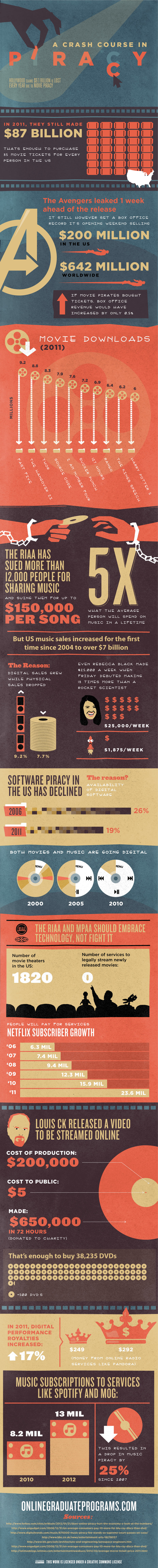
A Crash Course in Online Piracy
I was contacted via email by Katherine Long, who is part of OnlineGraduatePrograms.com, a team of designers and researchers that designed a graphic which highlights how the billions of dollars that Hollywood claims to lose due to piracy, isn't all that they make it out to be. In fact, it may be helping them. She kindly offered to share the graphic with collage clearinghouse readers and I was happy to oblige. It's really well done, and I love the way the graphic symbols match the content.
I was also amazed with the facts in it's content. Take a look for yourself, and see where your opinion lies...
I was also amazed with the facts in it's content. Take a look for yourself, and see where your opinion lies...
Subscribe to:
Posts (Atom)