5/31/2011

Rags to Riches (in Stratford)

How does that saying go? 
One man's junk is another man's treasure.
There's this juxtaposition of the rhinestones against the ramshackle shed. The heavy substrate allowed me to attach heavier objects to this work. The protruding 3d front door will be enhanced further when I install a tiny blue LED light underneath the drawer pull. It should shine an eerie light down upon the front door and reflect off of the jewels.
I feel like these pieces are so vulnerable and fragile, sticking out from the base with no protection like this. The art is almost as fragile as the actual buildings they depict!

It was all she had, this humble ramshackle home in the woods.
a jewel in the rough.

Protruding Front door
Rags to Riches
(in Stratford)
Mixed Media on vintage cabinet drawer front
Book endpapers, laser prints taken in Stratford, 35mm photos, vintage blueprint, vintage magazine ad, various rhinestone jewelry parts, vintage engraving, postcard 

5/20/2011

Sachem 2

Sa Ga Yeath Qua Pieth Tow
Brant
 This is Indian piece #2. It's going along with that video I started to do months ago. It's so difficult to go and pour myself into something that I have left behind for awhile. Stretching in my memory banks, I try to pull out the emotions that drew me to this idea in the first place. It's such a struggle! I seem to require an intense amount of concentration to be able to continue along in a particular subject. I work full time-part time-and now free lance. It's difficult to find the free time for me to address these things. When these periods happen when life seems to get in the way of my own pursuits, I get a strange anxiety as I face the paper again. Can I meet my own expectations yet? Can I even meet the quality of what I was doing before? I doubt myself, and my skills feel rusty. I hate these feelings, but maybe, just maybe this time I have had enough time to digest some new ideas....some new life. I threw away over half of my ephemera collection. I also have new rules I am following. Will anything change? It has to. It's the law of our planet.
Now, more than ever, I am hoping for something to emerge from this cocoon I have been hibernating in.

King John

Altered Books Final

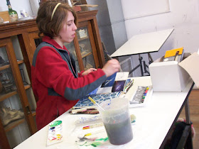
 This past semester I taught design at SUNY Cobleskill again, and I tried a really crazy idea for the final project. After learning about line, shape, texture, color, etc....I had them create altered books as the final.

Erik B reworking a Bible! He had music as his theme and revealed that music was spiritual for him.
They needed to create at least 4 sections, and design the cover--keeping some kind of unity and theme across the book.
The very prolific Gaby D works on her altered '70s biology book, giving it a hippy rainbow attitude. 

It was a month long journey, with the students going crazy over these books.
Melique G drawing in his unique raw style within his altered Encyclopedia. 

I watched the whole thing unfold and as they worked on them, I learned as much as they did.

Brittany S covered her book with leather and made an enclosure out of a nail she plucked out of the wall in class.

The various ways they tackled the theme, the interesting things they did with their pages, their utter involvement, it was just fascinating and I am so glad I decided to go this route as the final!
Josh T completely covered this book with gesso, and then created a masterpiece book about rain
The rewards for stepping out of our boxes are many.

5/18/2011

"Re-planetizing Daniel"


Steve Specht here...
My latest as I get ready for the show in Canajorharie. Hope you enjoy!

5/03/2011

WAY too long!


Steve Specht here...
It's been WAY too long since I posted last. The good news is that the semester is almost over and I look forward to posting vmore through May and the summer. This morning I'd like to share with you a piece I put together which is a bit deviant from my typical style (although, of course, you can probably see my "voice" in the piece as well). I was working on a piece for the 6 X 6 show at the Rochester Contemporary Arts Center (more on that later) and had several 300lb watercolor paper substrate pieces prepared for the project. I ended-up having a piece left-over. The paper was painted with a mixed green acrylic paint and then I took a "metallic" blue spray paint can and held it above the paper about two feet and sprayed a fine "mist" down onto the painted paper. It really provided a nice effect-- a little sparkly (not too much) and a nice blue green hue (see detail). I had some elements laying around that I had prepared for use without having a specific purpose for them (it's collage afterall, right?). So I just started experimenting without much intention. I realize that other collagists do this often; but my approach typically is driven ("dogged") by a need for more intentional composition (for better or for worse)... you can ask Julie about; she's seen me work ;-). Anyway, this is what emerged from my play. I have entitled it "He stunned her with his emptiness" (5" x 7"). Enjoy!